
How CLS Impacts Design More Than Development
 Nov. 13, 2025, 12:00 AM
When it comes to website performance, you may often hear about metrics like speed and page load time. But one metric that quietly impacts your user experience is Cumulative Layout Shift, or CLS.
If you’ve ever seen buttons jump or images move while a page loads, that’s CLS in action. As a designer, this should matter to you even more than to developers.This is because layout stability starts with your design decisions.
The spacing, font sizes, image dimensions, and visual hierarchy you choose directly affect how stable a page feels as it loads. Developers can only fix what’s built, but you shape how it’s built from the start.
Understanding CLS helps you create visually consistent and user-friendly pages that load smoothly and feel professional.
Why Designers Must Tackle CLS the Right Way Rather than Leaving it for Developers?
1. Not the Developers Problem But the Design
CLS occurs when the elements move due to their size or portion not being reversed early for the rendering process. As a result, there will be loaded content, ads, images and widgets. But to know, these elements come directly from design decisions.
For instance, if you design a hero section without a proper height, things might look better over a speedy connection. Whereas, on a slower network, the images might load late with heading jumps. And the call to action might disappear too.
So, designers must handle the layout and structure. CLS will measure if these can handle real-world conditions.
2. Managing UX that Frustrates Website Users
CLS may quantify over unexpected movement of page elements while a user is interacting with it. For example, as you click on ‘Read More,’ the banner image may load late and you end up clicking a ad. This could actually be frustrating.
This is a User Experience problem that CLS measures while causing high bounce rates. Besides, Google depends on CLS as a part of its search ranking algorithm. Yet beyond SEO, bad CLS hampers brand credibility, and interferes in the way of people interacting with your product.
Even still, most designers are unaware that such a thing exists and how much their layout are contributing to this issue.
3. Thinking Everything Looks Fine on Machines
The web development world of today spans across every device and connection. These can be high-end laptops, networks, and low spec phones. What may look good in Macbook might offer a horrible experience on a low cost Android phone.
So, it’s not the screen size here. Things are about loading order, asset priorities and just when each of the elements are appearing. Furthermore, CLS will penalize the designs that fail to handle such unpredictable conditions.
4. Mobile CLS that Causes a Huge Mess
Coming to mobile, layout shifts can be more daunting on phones because of the screen size. Users interact while the page is still loading. When something shifts as the user is about to tap, it’s a complete functional issue.
Such misclicks lead to form abandonment, purchase mistakes and uninstalls. All of this happen only because the banner image loads slowly or the font swap pushed a button.
Combining layout instability with thumb sized targets will fetch you UX anti-patterns that may look normal in Figma but fail in real world.
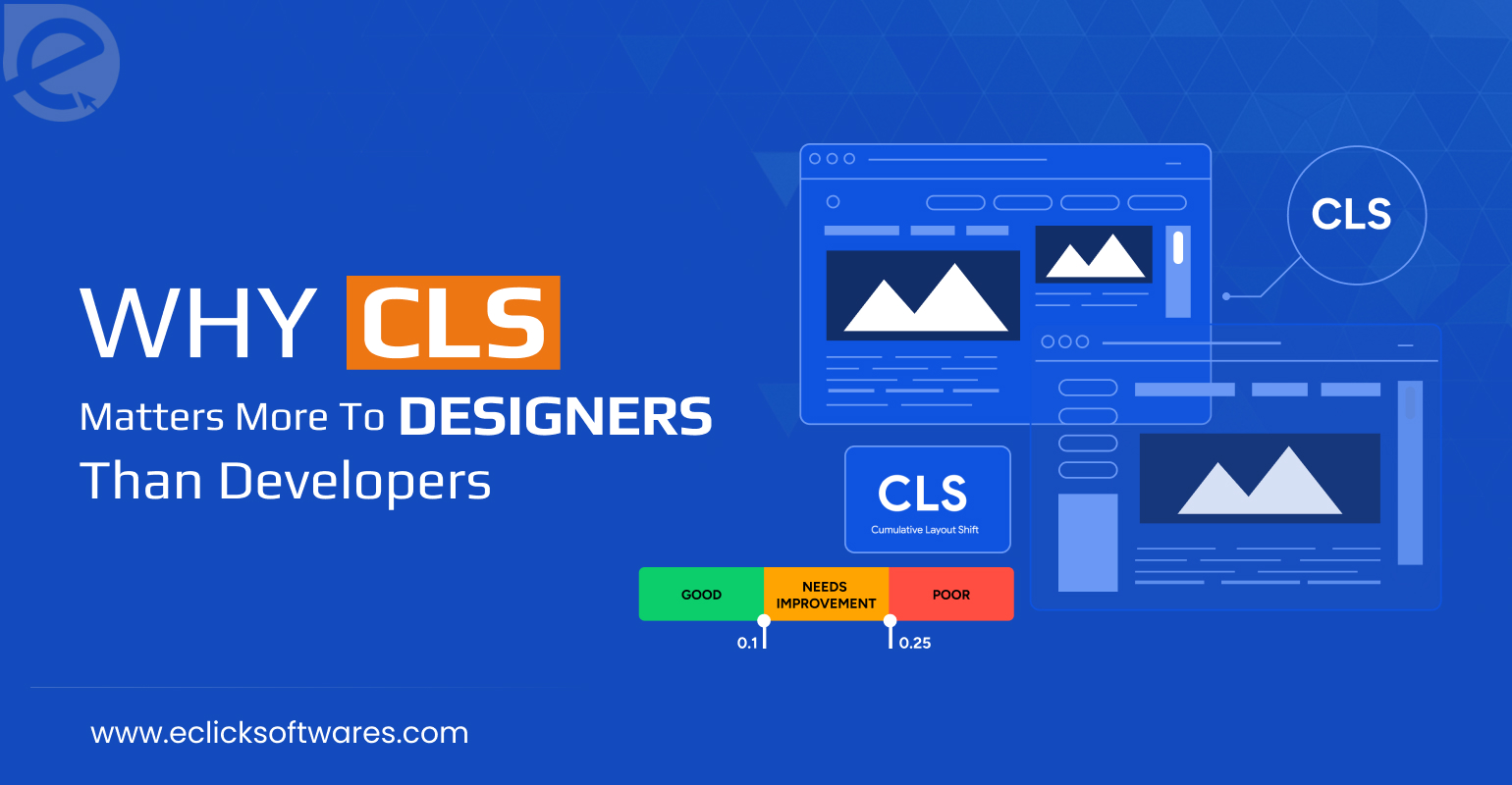
5. CLS is Not a Score but a Design Signal
CLS gives a direct signal to how predictable and trustworthy your design layout is. Users would want to engage with a page that is solid rather than something that is going under fingertips.
Having a low CLS score means polish, care and control. Higher one means junks and failure in testing accurately. Remember, your users must not spend 3 seconds deciding whether your site is credible or not.
How Do You Maintain a Design First Thinking?
2026 will be the year of mature design system that will not be just modular or responsive. Everything will be CLS conscious.
You must start infusing performance and stability thinking directly into your design workflows.
Here’s what everyone must do right away:
• Use aspect ratio aware components from your design library. Your layout will be fragile if your image cards, embeds, or video blocks do not define any space.
• Your mockups must include loading states and skeletons. This is necessary for alignment with content strategy and UX rhythm.
• Match the font metrics wherever possible to reduce the swap distortion.
• Create safe zones for dynamic content. Design particularly for that spacing if you are expecting an ad or alert.
Finally, it is understood that web is a moving target. Your website will rearrange itself based on speed, conditions, personalization and script order. The future of design is about how things behave as they appear. Having a beautiful layout with multiple shifts is worse than a stable design. Make sure every designer keeps this in mind always!

What Is a CDN and Why It ...
Explore how CDN enhances web development speed, boosts perfo ...
Read More
Benefits of AI-Optimized ...
Transform your business with AI-optimized web development fr ...
Read More