We Develop Websites Keeping Marketing in Mind
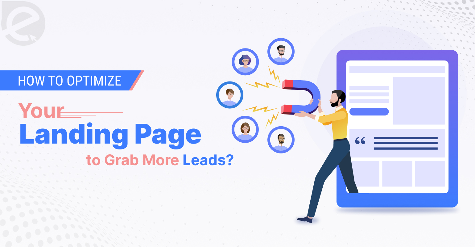
How to Optimize Your Landing Page to Grab More Leads?
 Oct. 03, 2025, 12:00 AM
- By Eclick Softwares and Solutions

Driving traffic to your website is only half the battle won. What matters here is how does everything take place once people land on your page. If they are unable to understand your offer or cannot figure out what to do next, they will head to your competitor website within seconds.The difference between a landing page that quietly leaks visitors and one that consistently generates leads often comes down to just small tweaks here and there. From the headline you write to the speed of your page loads, every detail shapes how the users respond to your site.
How to Increase Your Landing Page Conversion Rate?
1. Fix Your Hero Section First
The hero section is the front door of your landing page. Most visitors will decide within seconds whether to step in or walk away. That is why your headline, subheadline, visuals, and primary call to action need to work in harmony. Your strong hero headline must be able to communicate what you offer and why it matters.
Visuals here are just as important. Try showcasing a picture that demonstrates your offer, a short videos, or even a strong lifestyle image to portray your message better than words alone. Do not bury your CTA somewhere down the page either.
Placing a bold or contrasting button above the fold tells visitors right away what action you would like them to take. Think of your hero section as your elevator pitch. If it cannot grab someone’s attention and explain your offer within ten seconds, you will lose them before they even scroll.
2. Bring Clarity in Your Headline & Messaging
If your messaging is unclear, your conversions will be too. Visitors will not want to decode your meaning or guess at what you do. They want clarity from the very first word. That means writing a headline that focuses on the main benefit of your offer or using a clever phrase that leaves people scratching their heads. Remember, an excellent landing page headline is usually short, direct, and framed around solving a specific problem.
Consistency matters here as well. For instance, If someone clicked an ad promising “50% off your first month,” the landing page headline should mirror that. Even the design elements you use must align with the ads or emails that brought people to the page.
When there is continuity between the message that brought them in and the page they land on, they are far more likely to stick around and convert.
3. Keep the Copy Lean and Benefit-Focused
You want to give people enough information to feel confident, but not so much that they feel overwhelmed once on your landing page. The smart trick here is focusing less on features and more on the benefits. Features describe your product and benefits explains how it can improve someone’s life or business.
Long blocks of text are hard to digest, so aim for short paragraphs with clear subheadings that guide readers along. Use bold highlights to emphasize main key points.
Avoid using any industry jargon that forces readers to slow down and translate. Your goal is to make it as effortless as possible for someone to scan your copy and immediately grasp what is in it for them.
4. Single & Strong Call to Action
Every landing page must drive visitors toward a single and focused action. This can be signing up for a free trial, booking a demo, or downloading a guide. You would not want to dilute attention by offering multiple choices. Too many CTAs can create friction and therefore it will kill conversions.
Your primary button should stand out visually. Using a color that contrasts with the rest of the page while still fitting your brand is recommended. The wording on the button matters as well. Submit or Click Here feels impersonal, but Get My Free Demo or Start Saving Time is specific and tied to a benefit.
Place your CTA above the fold so it is visible right away, and then repeat it strategically throughout the page for visitors who scroll further down. By the time someone is ready to act, your CTA should always be within easy reach.
5. Build Trust Faster with Social Proof
Even the most persuasive copy will not work if people do not trust you. That is where social proof comes in. Testimonials are one of the most powerful forms of social proof, especially when they include real names, photos, and specific results.
Anonymous quotes without context do not carry the same weight. Client logos are another trust-builder, particularly if they are recognizable brands in your industry. Case studies go a step further offering proof that your solution delivers measurable results.
Even small signals like trusted by 5,000 businesses worldwide or a mention of awards can trigger the visitors toward action. When your target audience see that others have walked the same path and benefited, they feel safer taking that next step themselves.
6. Optimize Load Time and Mobile First
Page speed is one of those invisible factors that has a huge impact on conversions. Research shows that even a one-second delay in load time can cut conversions by nearly 7%. If your landing page takes four or five seconds to load, you could be losing almost a third of your leads before they even see your content.
The solution is to streamline everything. Compress large images so they load faster, use lazy loading for videos or heavy assets, and eliminate unnecessary code or plugins. Make sure you are hosting on a reliable server with strong performance.
With more than half of web traffic coming from smartphones, a landing page that looks perfect on desktop but broken on mobile is a liability. Make sure to always design mobile-first. Test how your layout, forms, and CTAs appear on smaller screens. Smooth mobile experience can make the difference between someone bouncing and someone converting.
7. Keep Your Contact Forms Simple
Your form is often the final step before someone becomes a lead which makes it the most part of your funnel. The longer and more complicated it is, the more likely people are to abandon it. Start by asking only for the essentials like their name and email address.
If you are in need of more information, add it gradually through follow-up interactions rather than all at once. Some companies use progressive profiling, where returning visitors see different fields over time, so you collect data without overwhelming them on day one. There are also smart tools that can enrich a user’s profile automatically from just an email address.
In this way, you get the valuable background information without making the visitor lift a finger. Businesses that have trimmed down their forms from double-digit fields down to just three or four have reported conversion lifts of over 100 percent. Keeping everything simple is the key here.
8. Track, Test, and Repeat
Landing page optimization is an ongoing process. Start by tracking the basics that are the bounce rate, time on page, and conversion rate. Heatmap tools can show you where users click most often or where their attention drops off. From there, run A/B tests to experiment with one change at a time.
It can be a new headline, a different CTA phrase, or a shorter form. Testing in isolation lets you know exactly which changes are making a difference. Over time, you will discover what resonates best with your audience.
A 1% lift here means a 3% improvement there. Suddenly you are converting at twice the rate without increasing traffic or ad spend.
9. Use Visuals Strategically
Images and videos are powerful, but only if they serve a purpose. The right visual emits your message and draws attention to the most important parts of the page. The wrong one will distract or feels out of place.
High-quality images will work the best. Short videos can be even more effective, especially explainer videos under 90 seconds that highlight your product’s value quickly.
Visuals can also guide user behavior. Something as simple as a person in a photo looking toward your CTA button can subtly direct a visitor’s gaze. Arrows, lines, or design cues can do the same. The key is intentionality here. Every image should either clarify, reassure, or guide.
10. Know Where You Stack Up Conversion Benchmarks
It is natural to wonder whether your landing page is actually performing well. Industry benchmarks can give you a sense of where you stand. Across most industries, landing page conversion rates average between 2 and 5%. That means for every hundred visitors, only a handful are likely to convert.
Top-performing pages, however, regularly achieve conversion rates of five to 10%, sometimes even higher. Software and B2B companies tend to be on the lower end, often around 3%, while e-commerce and niche services can go higher.
The important thing is not to get discouraged if your first attempt lands in the average range. With consistent optimization, moving from 2% to 4% will double your leads without increasing traffic at all.
Optimizing a landing page means your message must be clear and simple. Every change you make should reduce friction and make it easier for visitors to take the next step. Some improvements will deliver instant results will pay off gradually. The important thing is to treat your landing page as a living part of your marketing strategy and not a static project. And in the end, that is what turns clicks into customers and directly into growth.
Related Blog
- By Eclick Softwares and Solutions
- January 2, 2026
What Is a CDN and Why It ...
Explore how CDN enhances web development speed, boosts perfo ...
Read More- By Eclick Softwares and Solutions
- December 24, 2025
Benefits of AI-Optimized ...
Transform your business with AI-optimized web development fr ...
Read MoreSearch Blog...
Recent Posts
Eclick Services


